YES HELLO
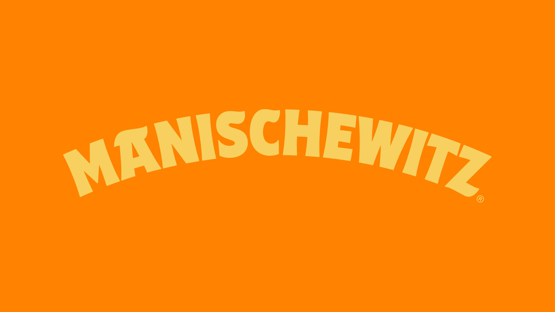
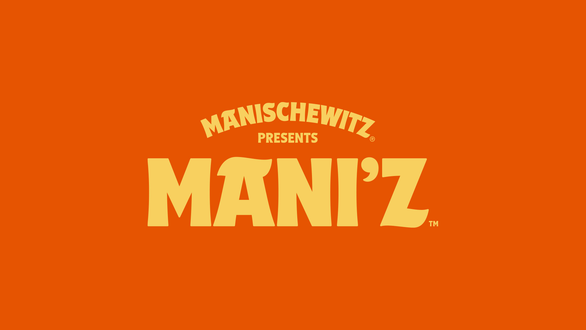
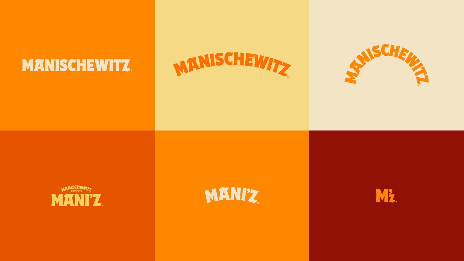
MANISCHEWITZ
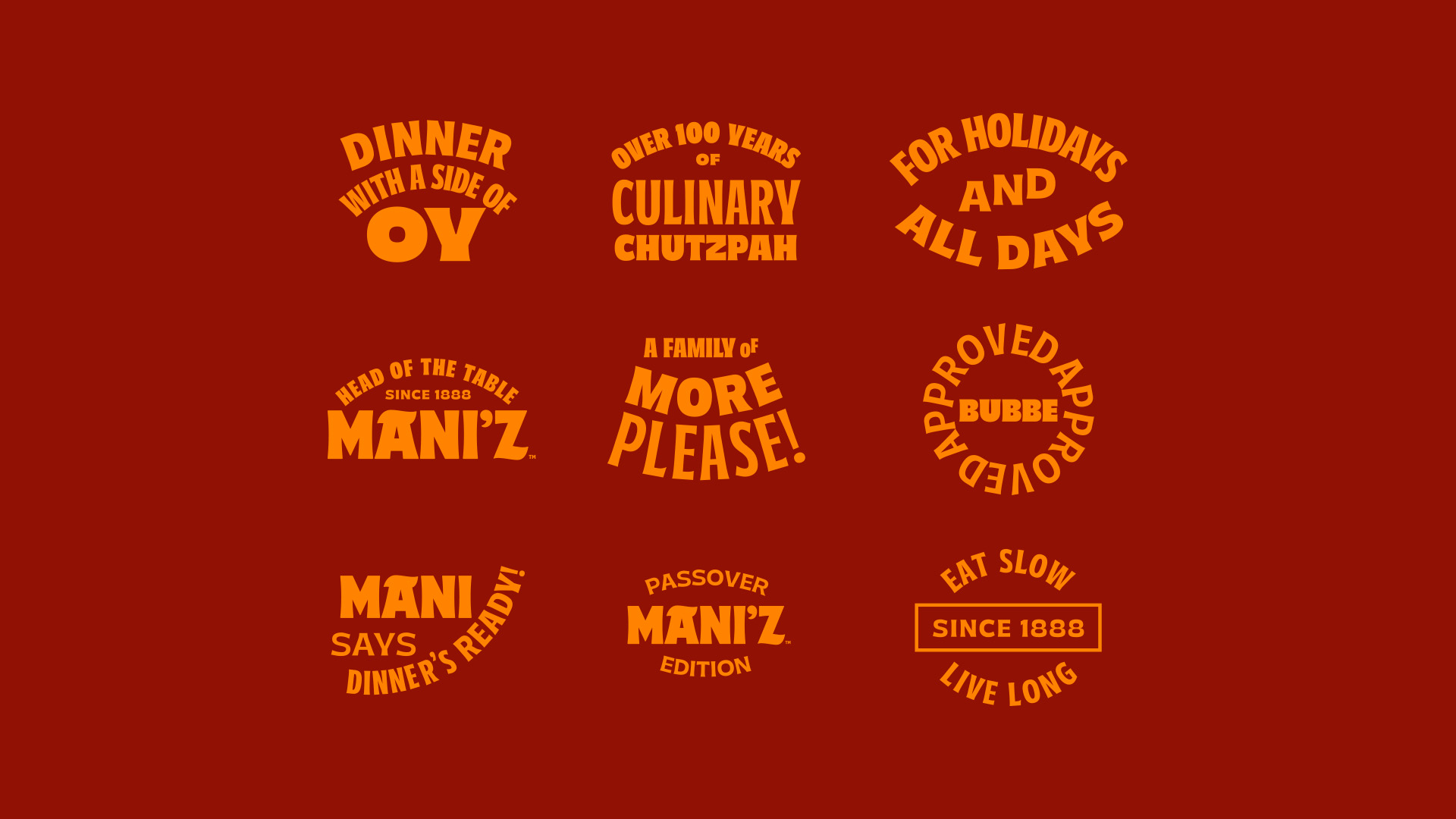
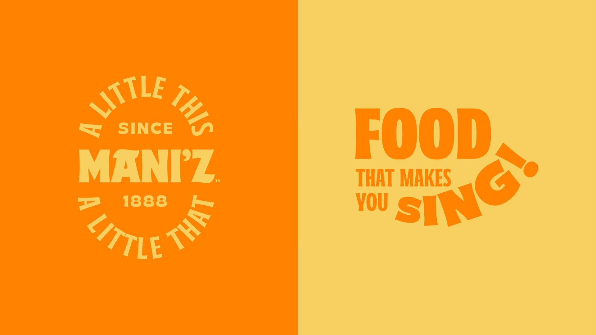
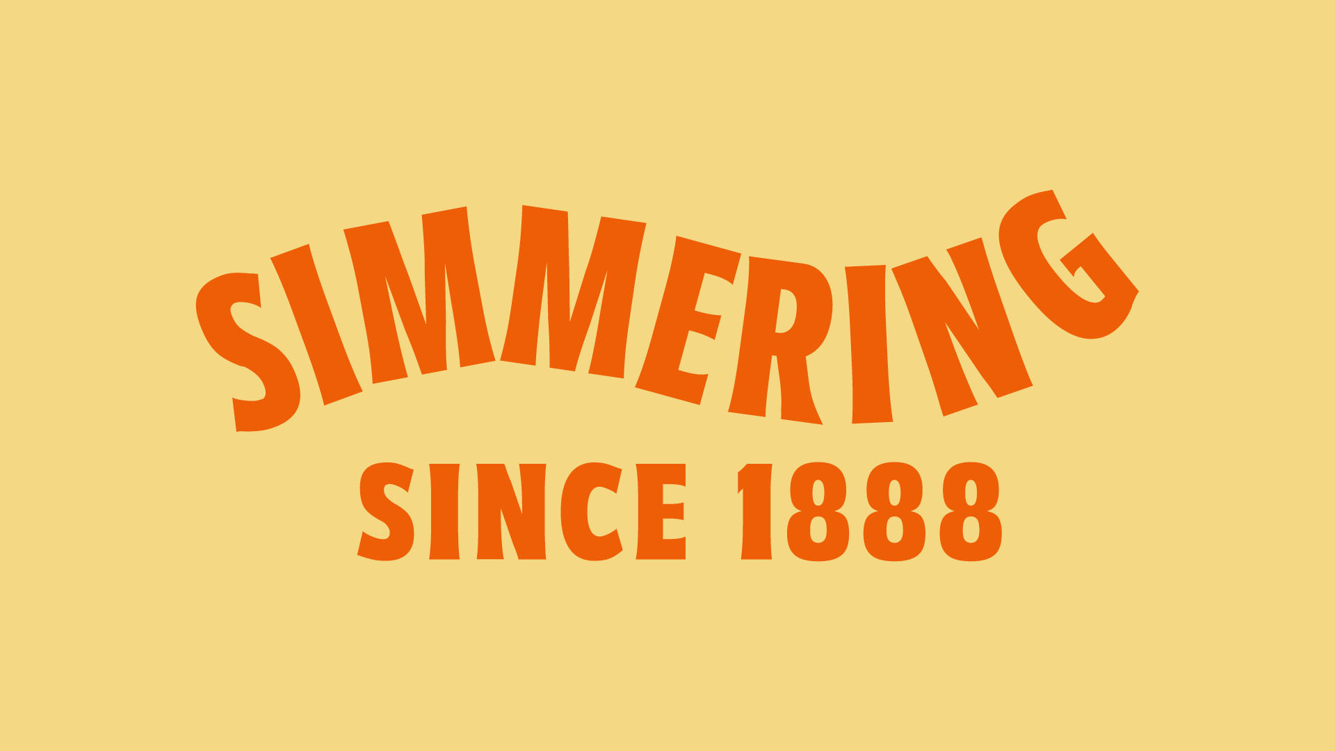
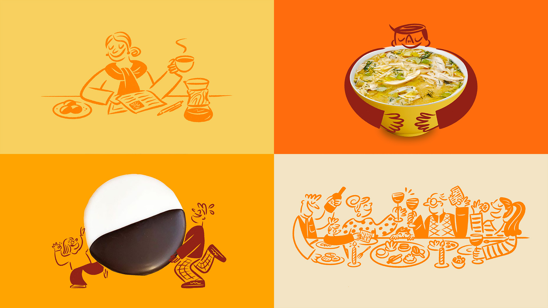
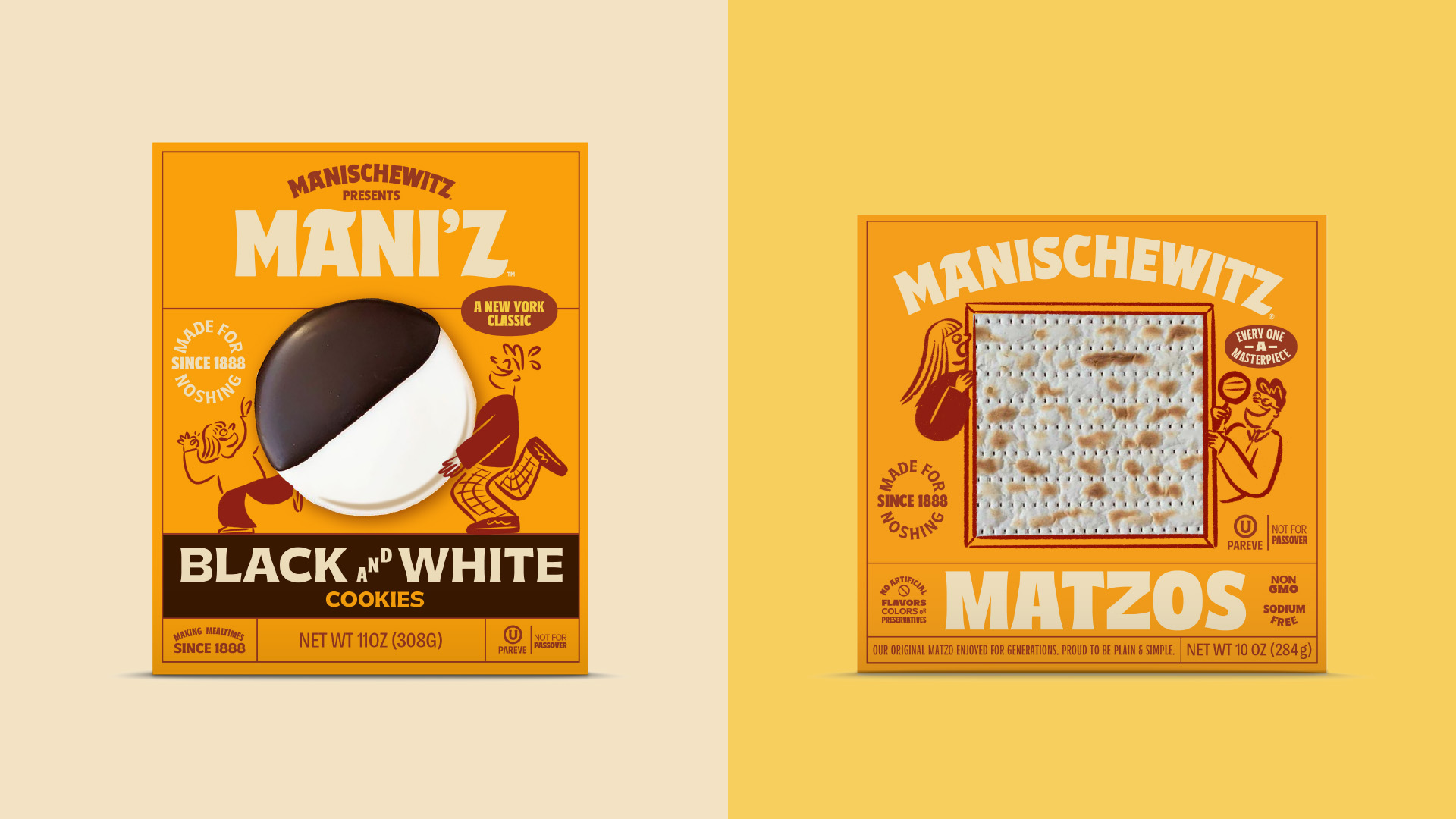
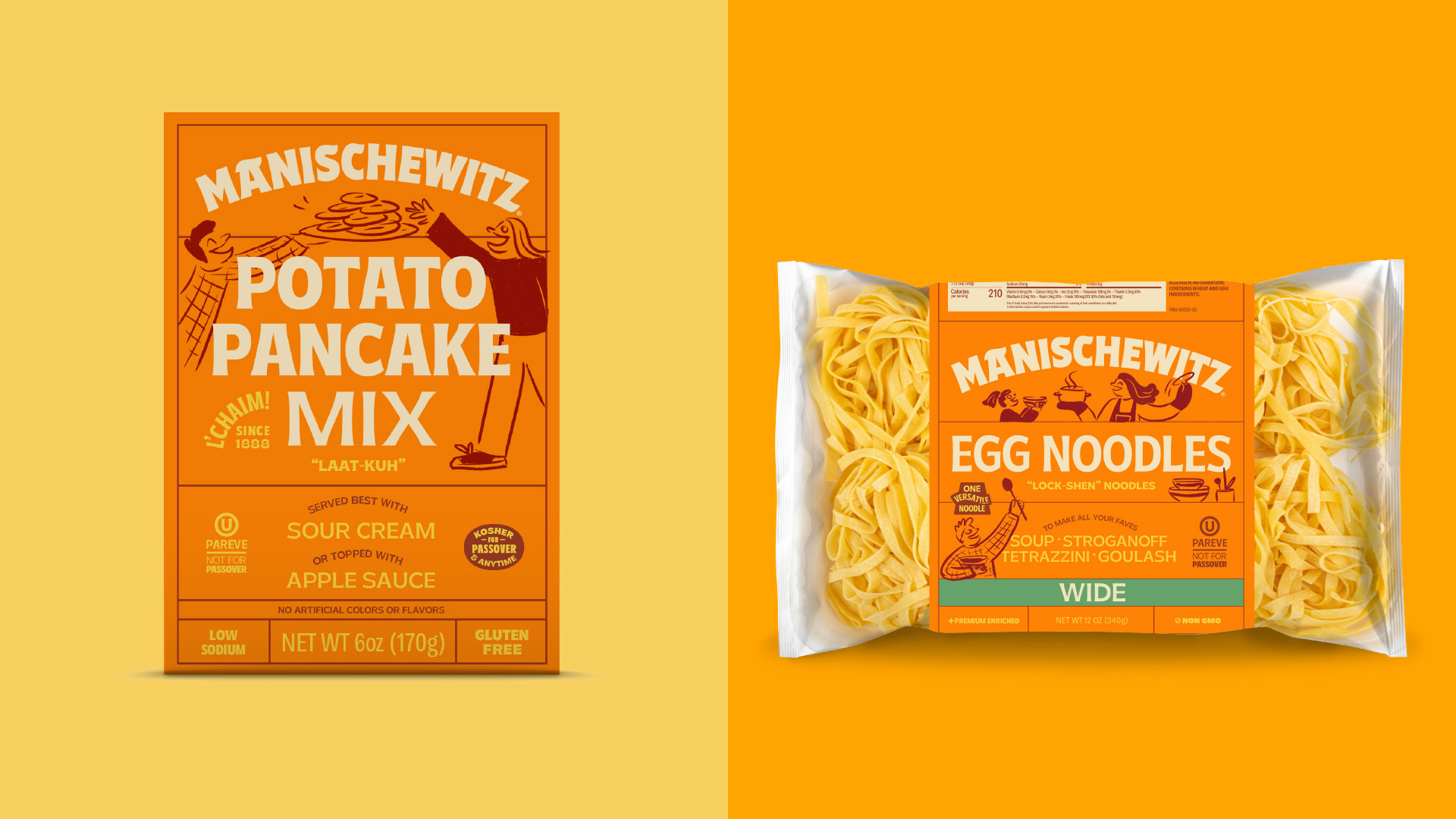
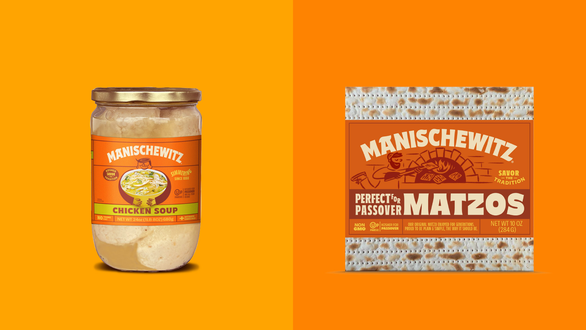
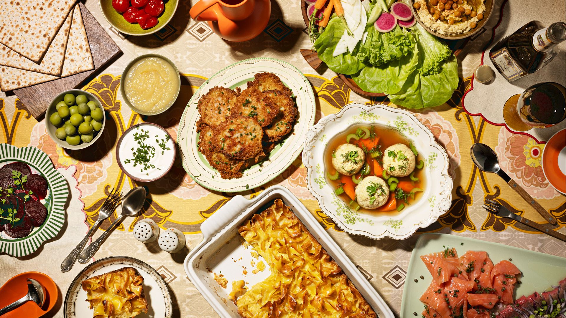
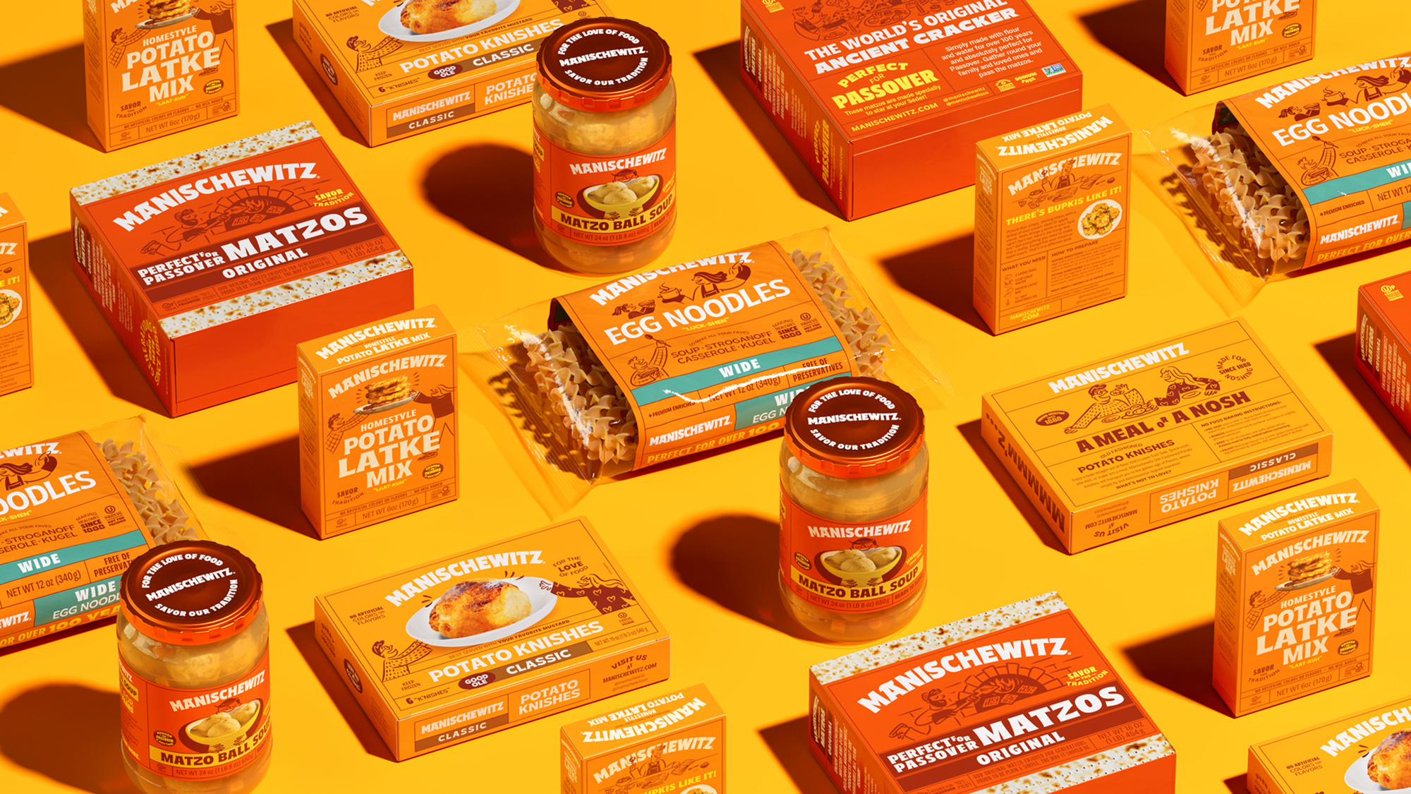
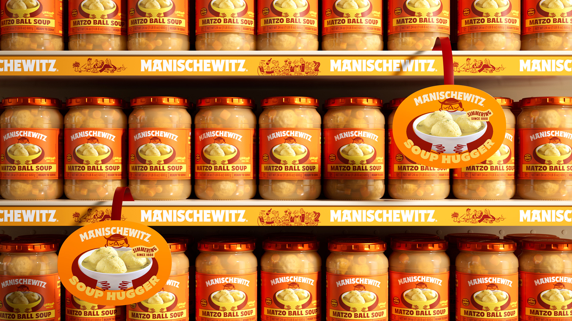
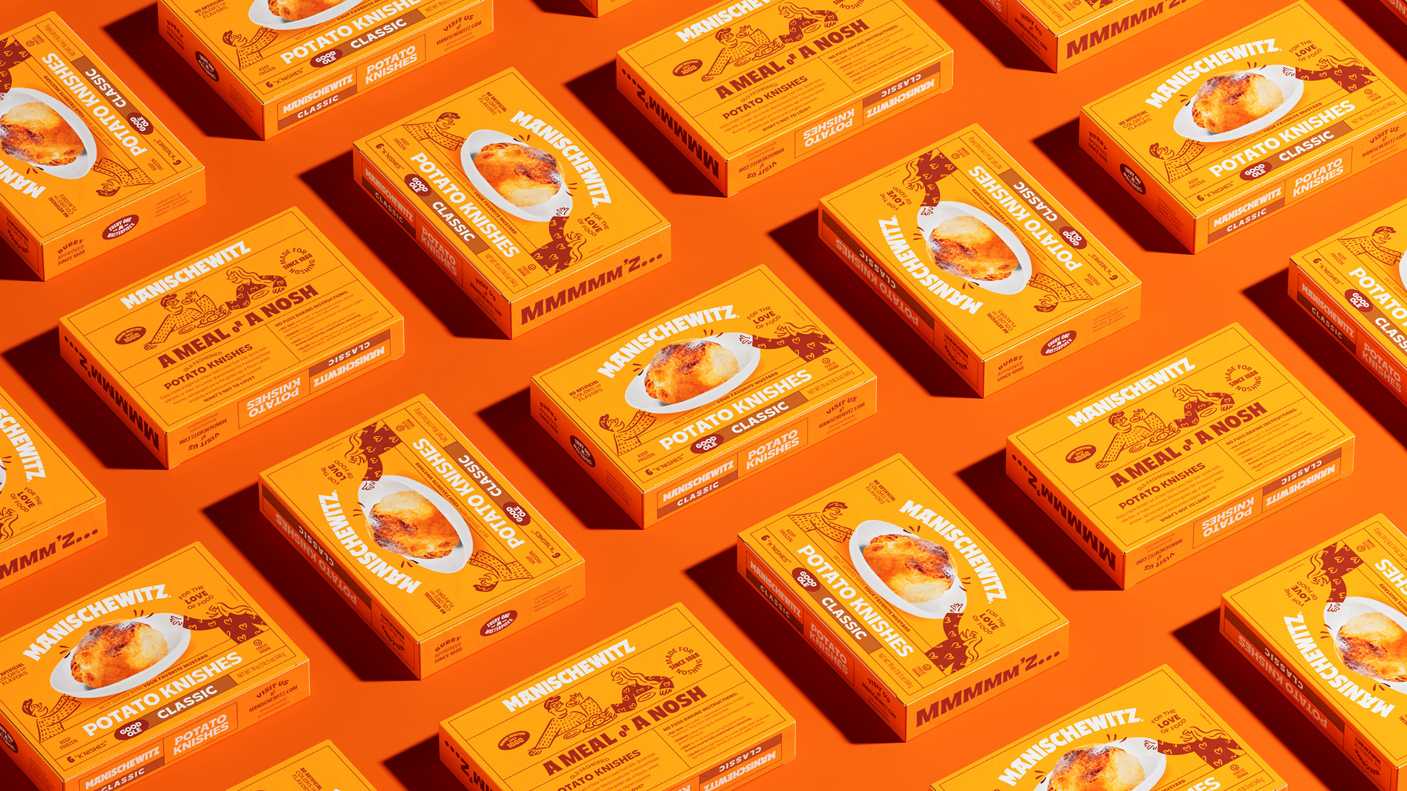
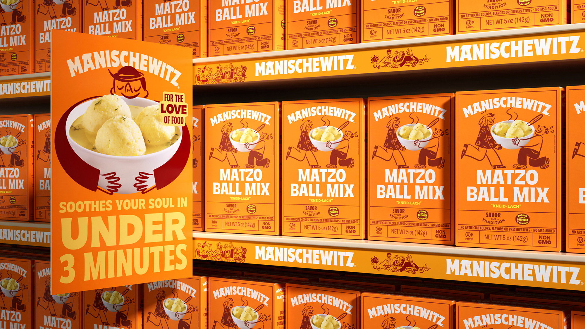
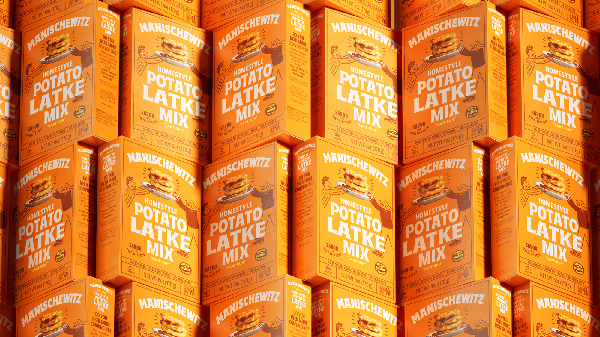
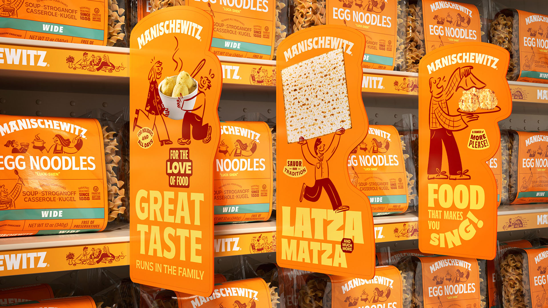
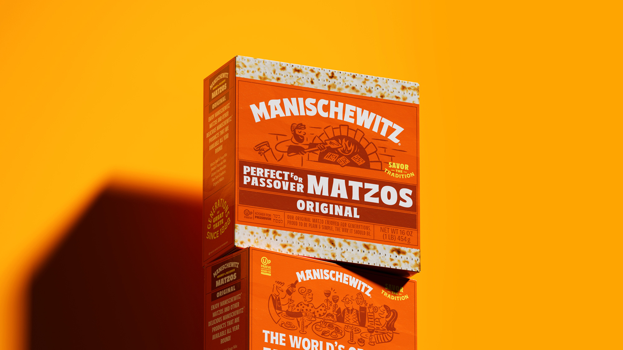
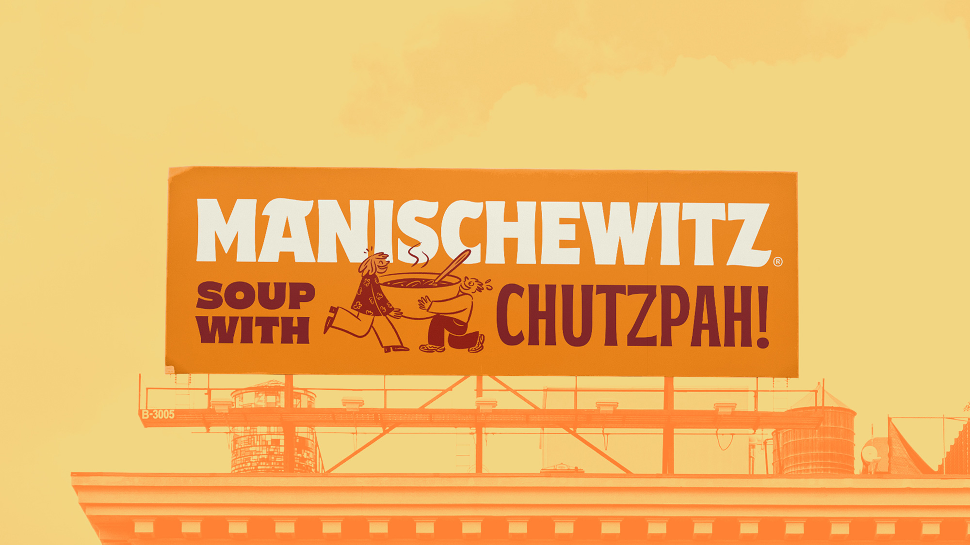
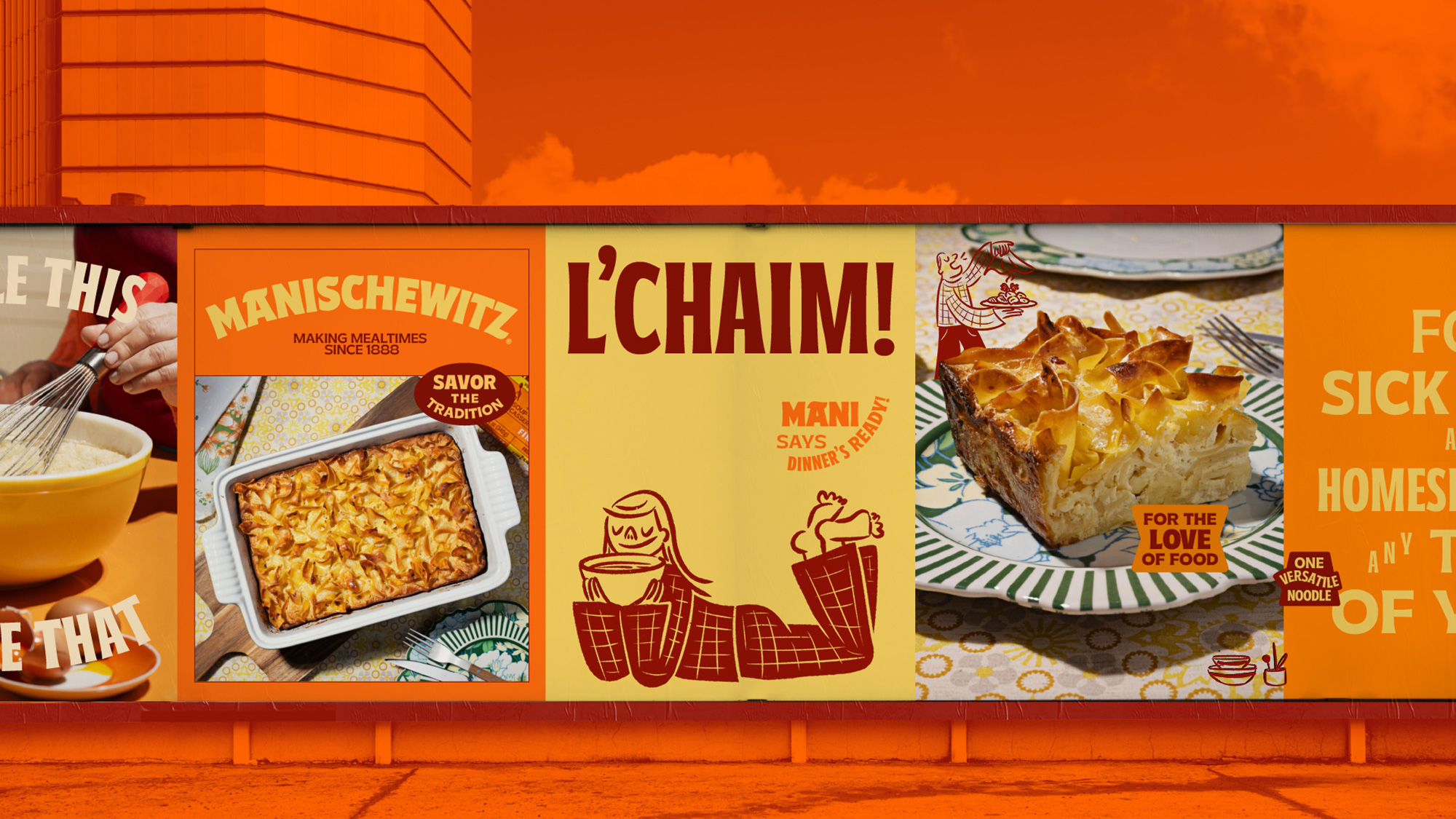
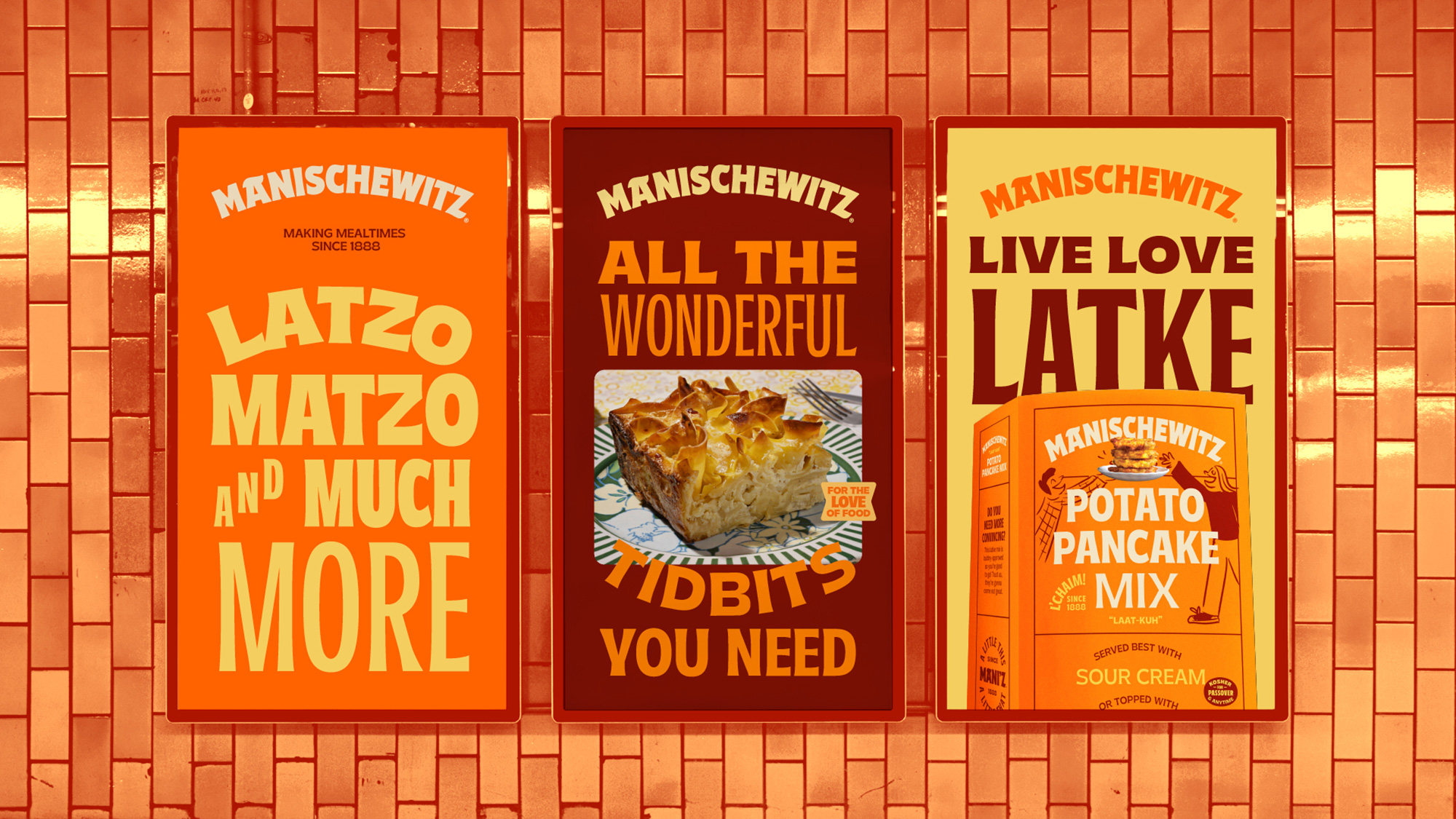
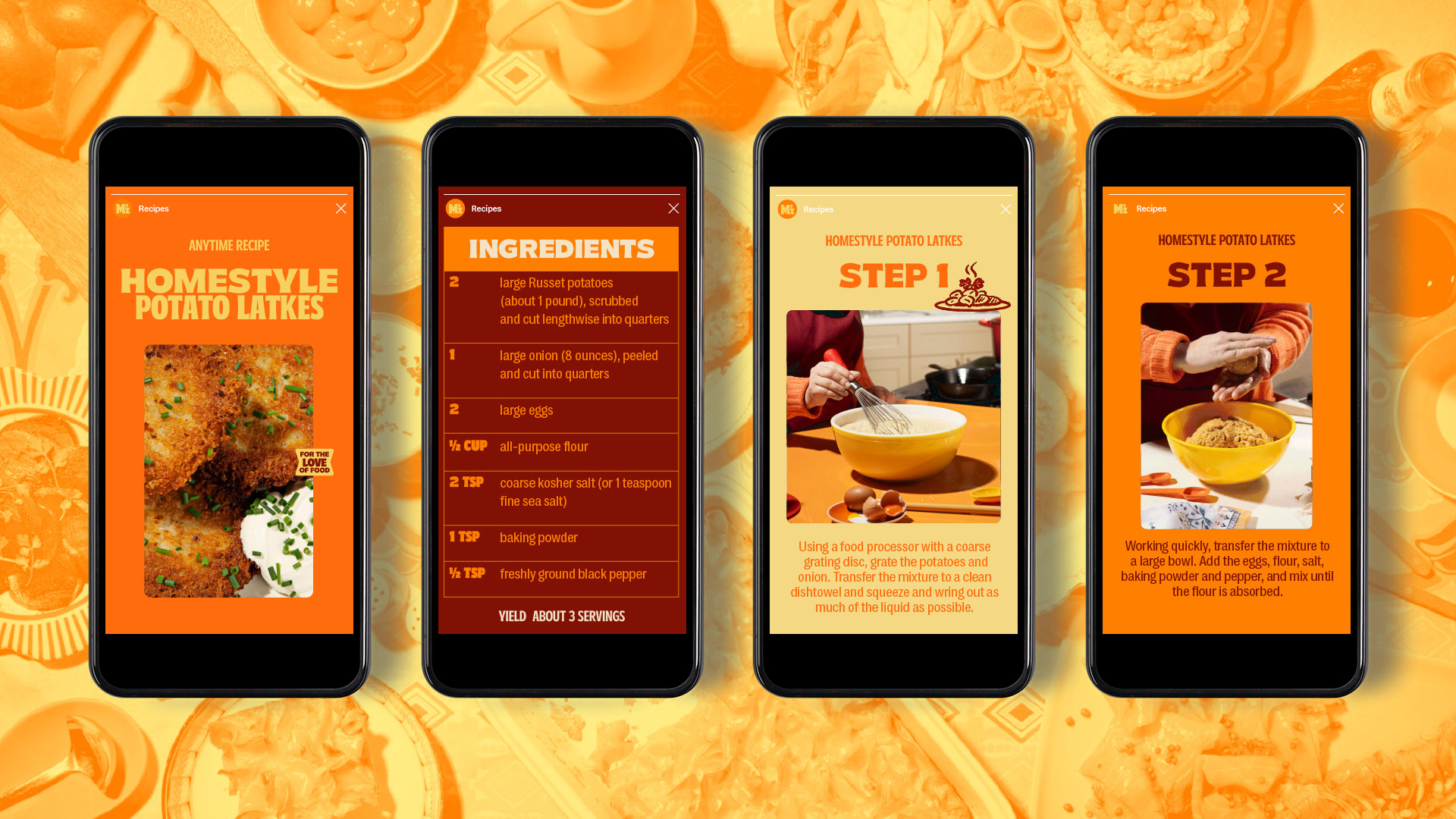
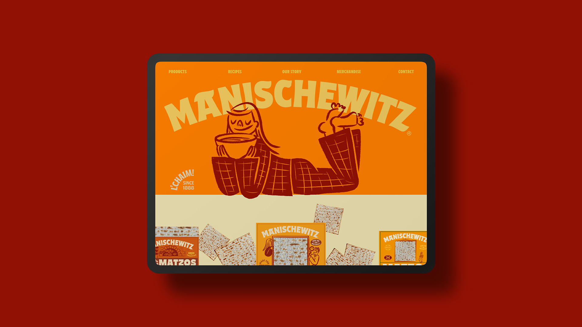
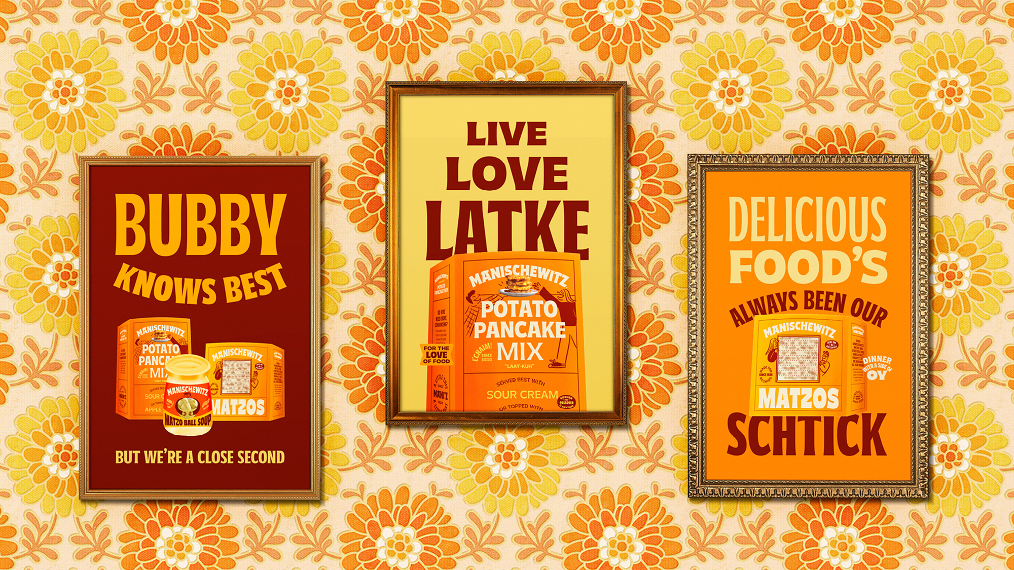
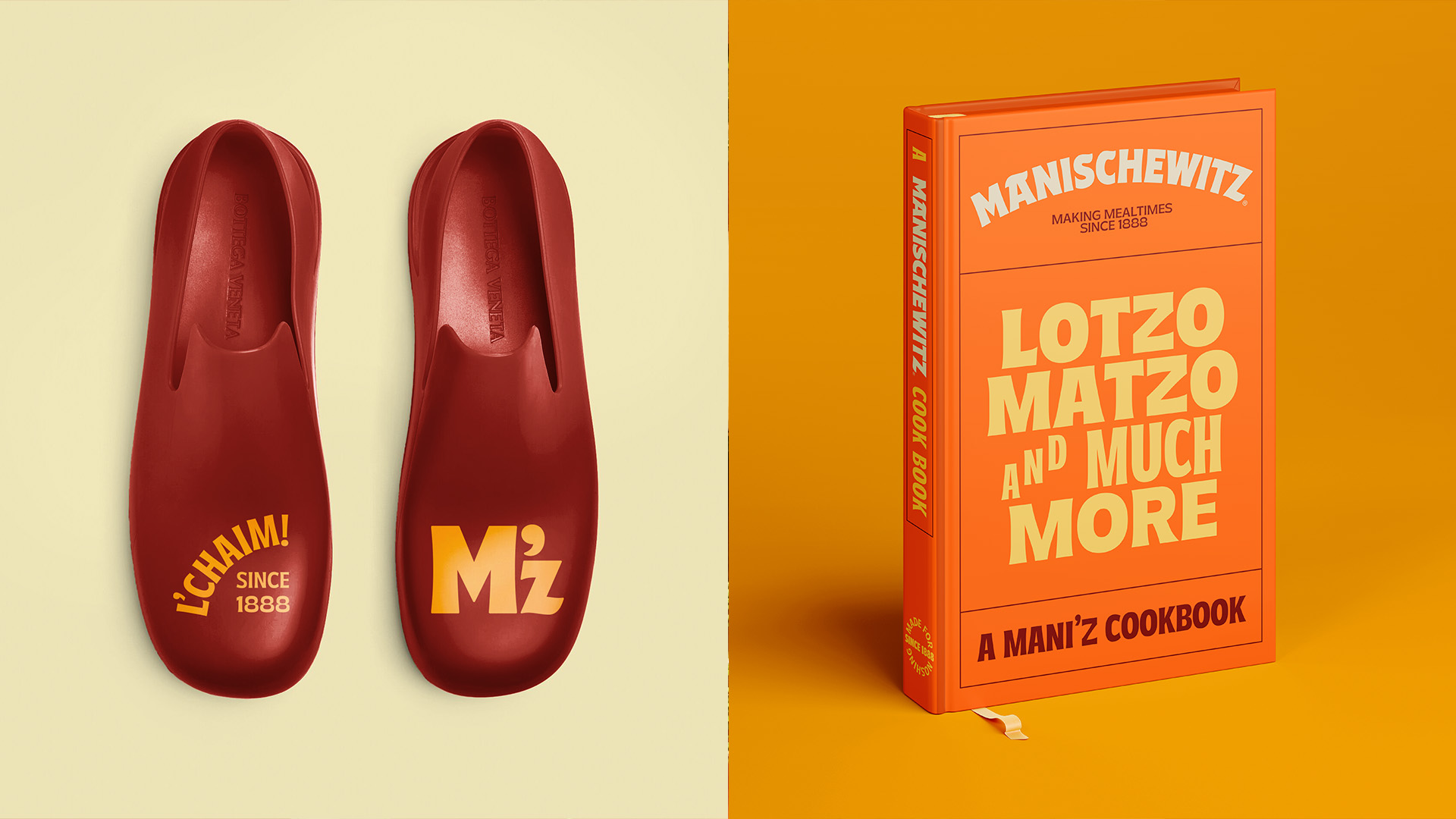
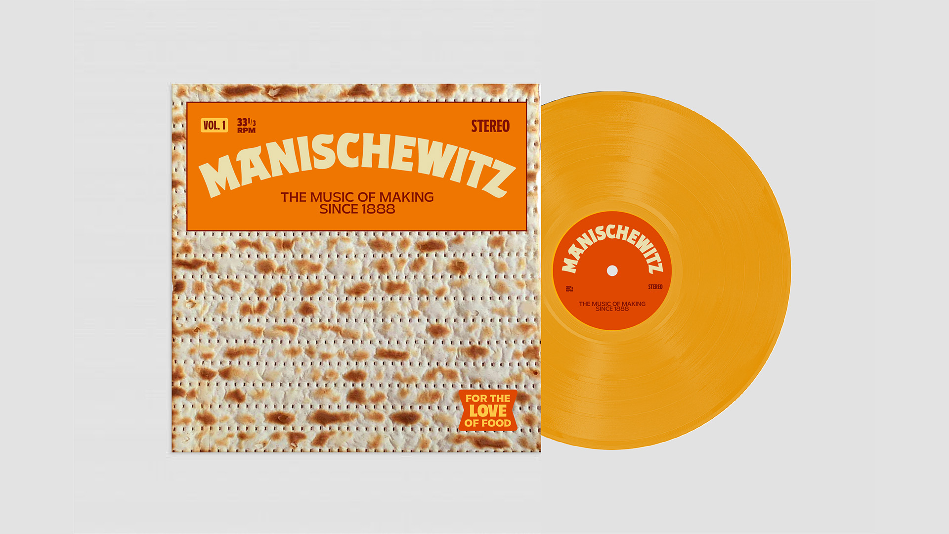
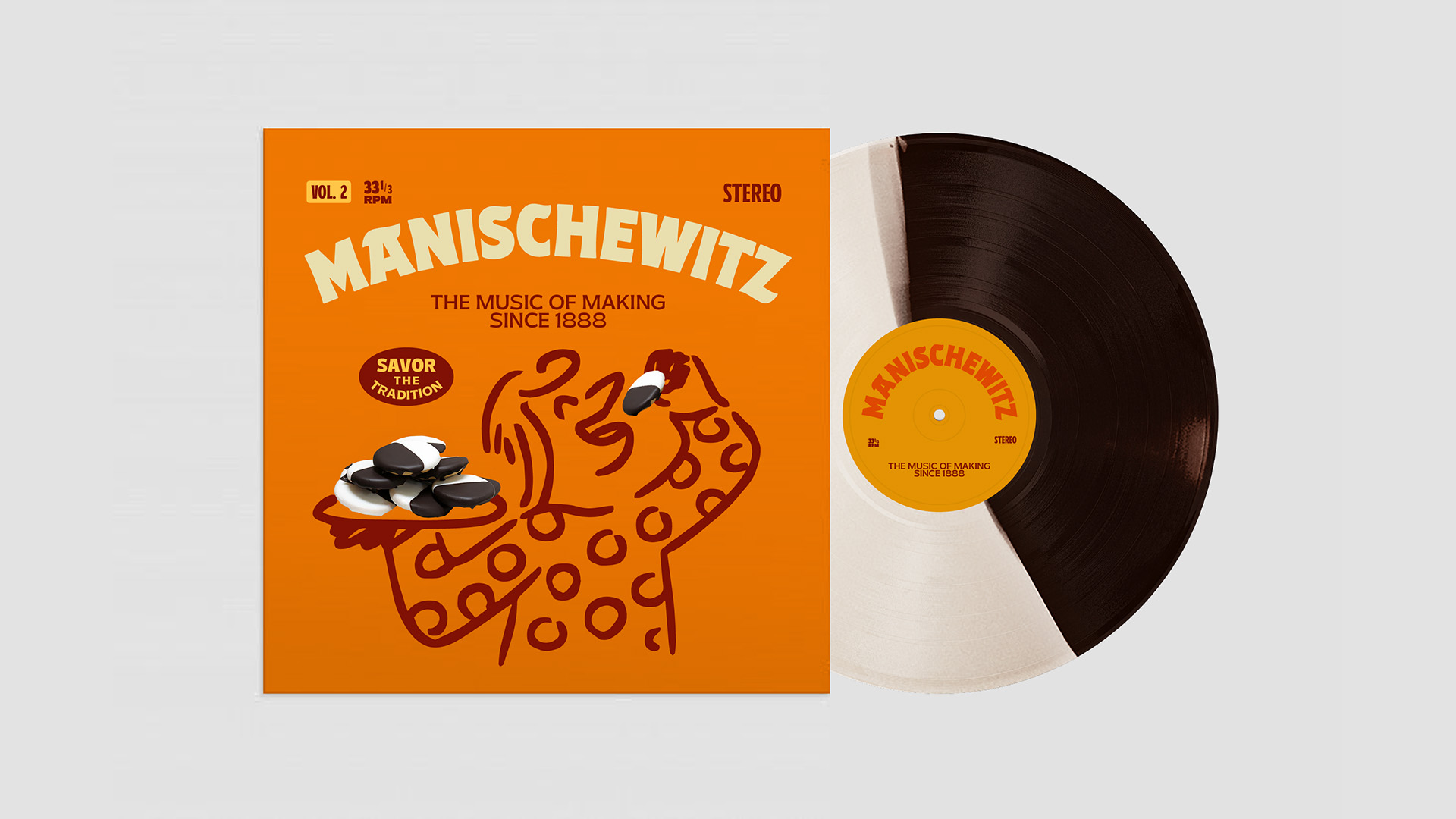
Identity and design direction for Manischewitz, elevating their traditional roots and empowering a growing audience to celebrate meaningful moments with the ambition of bringing family and friends together. Across all channels, the work exemplifies the inviting confidence, spirited personality, and craveable comfort that Manischewitz has offered since 1888.
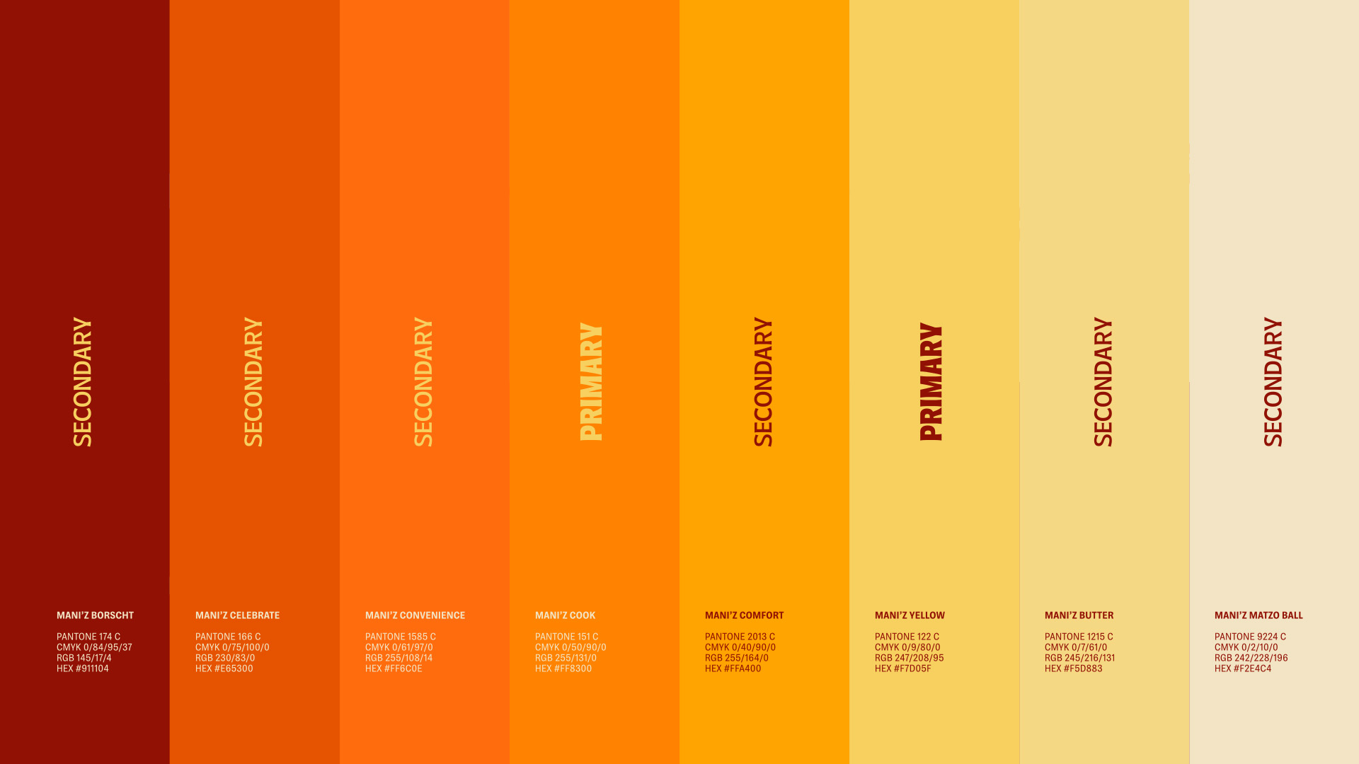
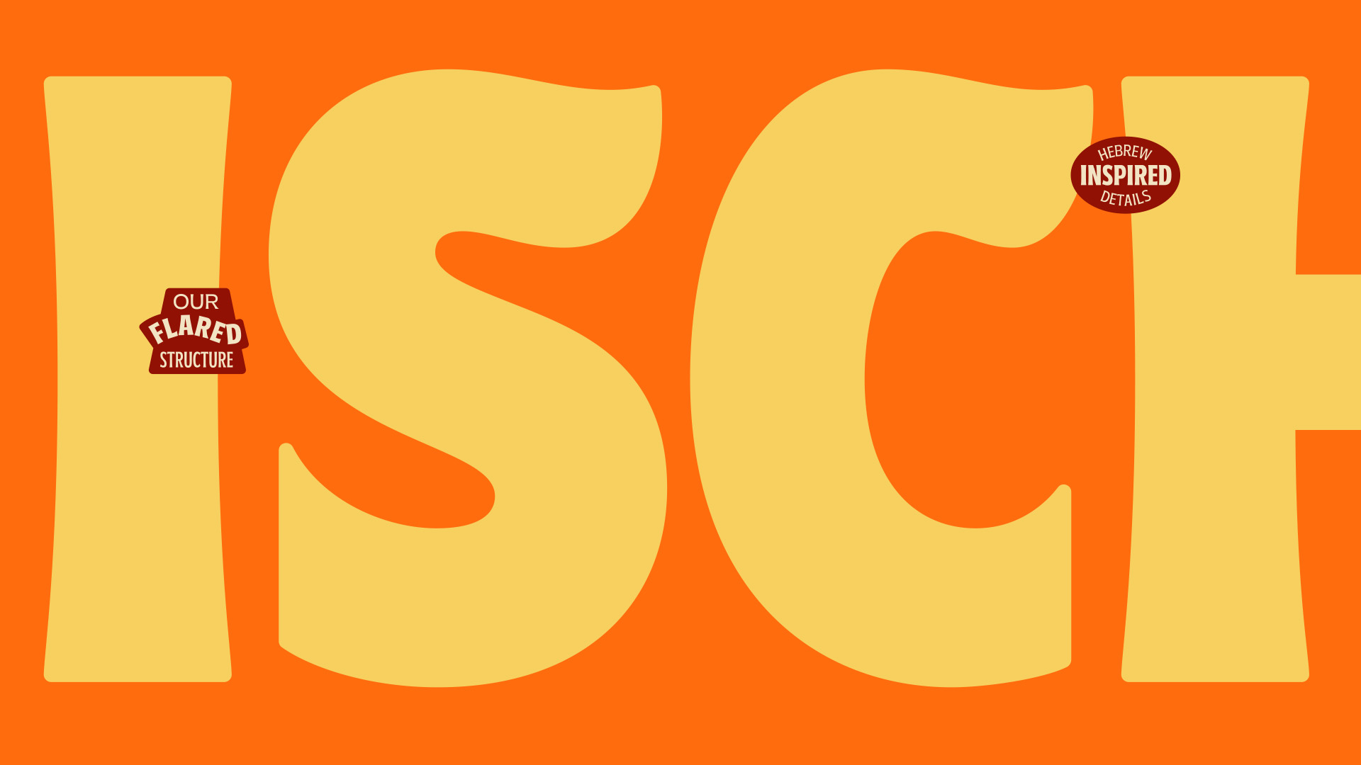
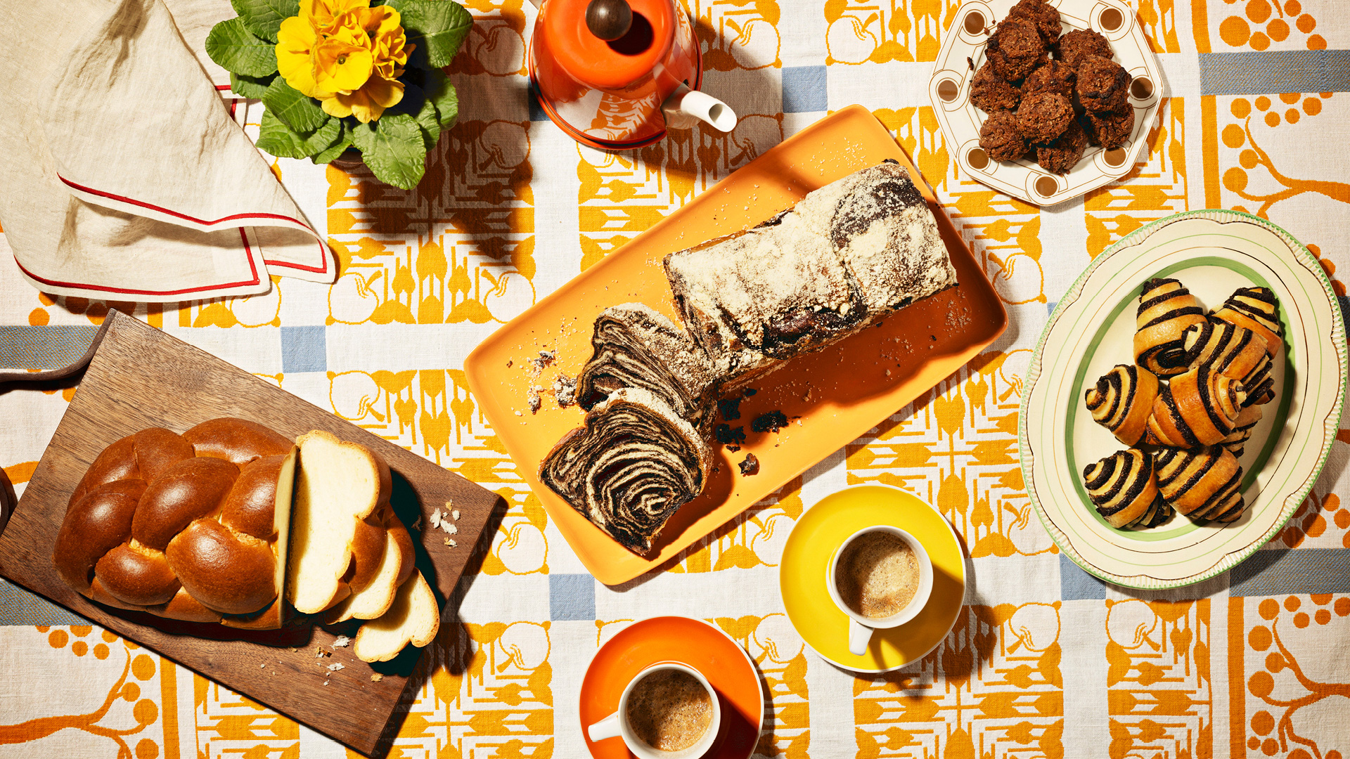
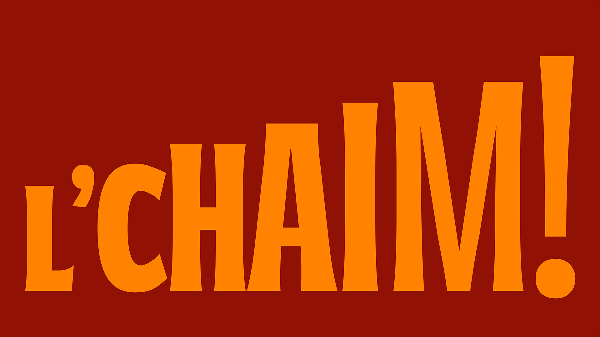
The palette leverages a familiar and warm family of oranges that complement the Hebrew-inspired letterforms of a highly versatile bespoke typeface. The illustration and photography style is inspired by family, tradition, and the spontaneity and fun of cooking food.
Winner of ADC Gold in Brand.
Featured on Dieline, Rebrand of the Year.
Featured on Brand New, The Best Work (2).
Featured on Brand New, The Most Notable (14).
Featured on Brand New, The Best in Packaging (2).
Featured on Brand New, The Best in Use of Typography (4).
Featured on Brand New, The Best in Color Palettes (14), Illustration (2), Photography (6).
Featured on Brand New, The Best in Introduction Videos (2).
Featured in The New York Times.
Featured in New York Magazine.
Featured in The Approval Matrix.
Featured in The Washington Post.
Featured in Forbes.
Featured on Brand New.
Featured on Dieline.
Featured in Ad Age.